design system
Transforming development efficiency and usability with a unified design system
The challenge
Streamline development & usability
As a early stage, high growth start-up, we had built features quickly in order to get feedback on our product offering as rapidly as possible. While that pace of development allowed us to find product market fit quickly, we left a trail of mismatched designs and patterns in our wake. As our feature set matured and we defined our position in the market, we were able to shift our mindset from purely building new features, to polishing and refining what we had.
This shift allowed for reflection across our design and development processes, as well as an audit of our existing user experiences. It became evident that we were duplicating efforts across design and engineering by recreating the same experiences (with slight tweaks, like a game of telephone), which ultimately created unnecessary confusion or frustration for users when learning the product. We set out to find ways to share front-end resources across the entire product development team, and create consistent patterns throughout the product to improve ease-of-use.
My Role
Product design / Front-end development / Implementation
current state
cluttered and redundant
After an audit of our codebase, I estimated roughly 9.4% of all lines of code contained custom or inline CSS, indicating that engineers were spending a disproportionate amount of time trying to adjust the UI to meet design specs. Each new design and UI was being created from scratch, as opposed having an agreed upon set of elements to pull from.
From a customer perspective, we estimated somewhere between 10-20% of help tickets opened were simple “how to” questions, asking for where to find certain features. As I parsed through the product, I found we were using different language, icons, styles, and interactions for the same actions. These discrepancies contributed to users’ confusion, as they were having to re-learn simple actions like ‘add’ or ‘edit’ many times over in order to take full advantage of the features offered.
The approach
a system built for designers & engineers
After evaluating our current practices, our solution was to create a design system, built to address the pain points both of the designers, and the engineers.
The process began with a thorough audit of all existing UIs in the product to identity where we where we could consolidate our designs, and create consistent experiences.
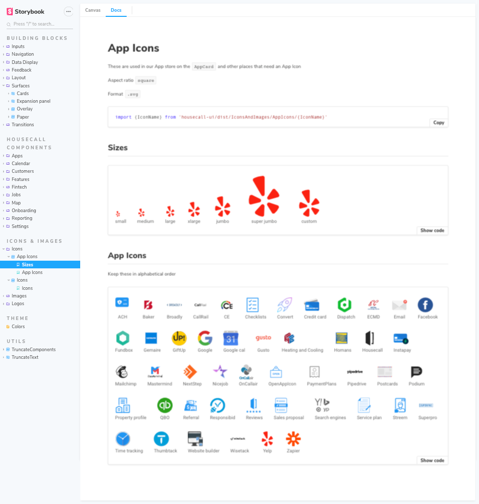
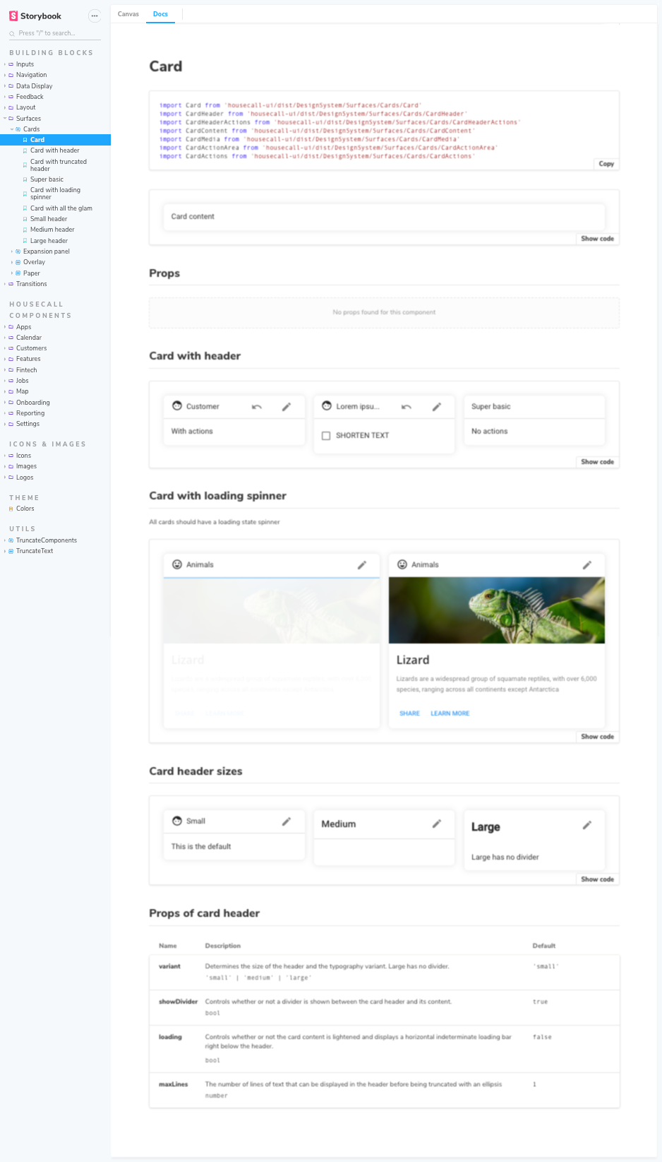
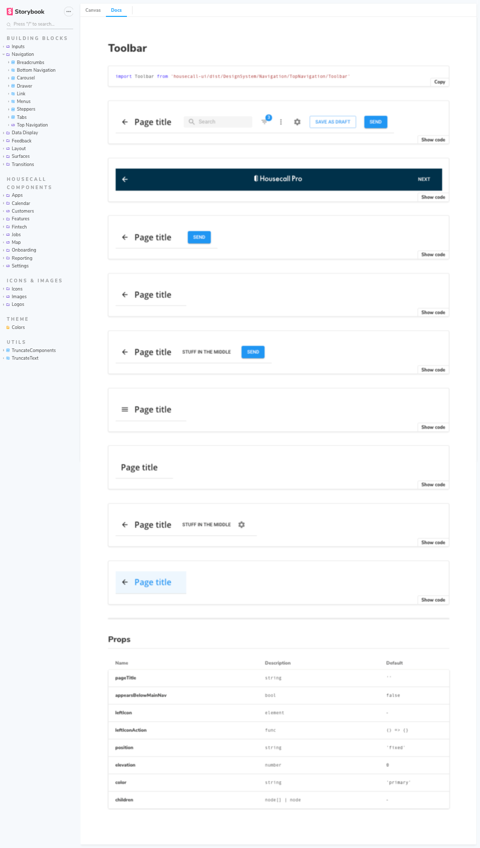
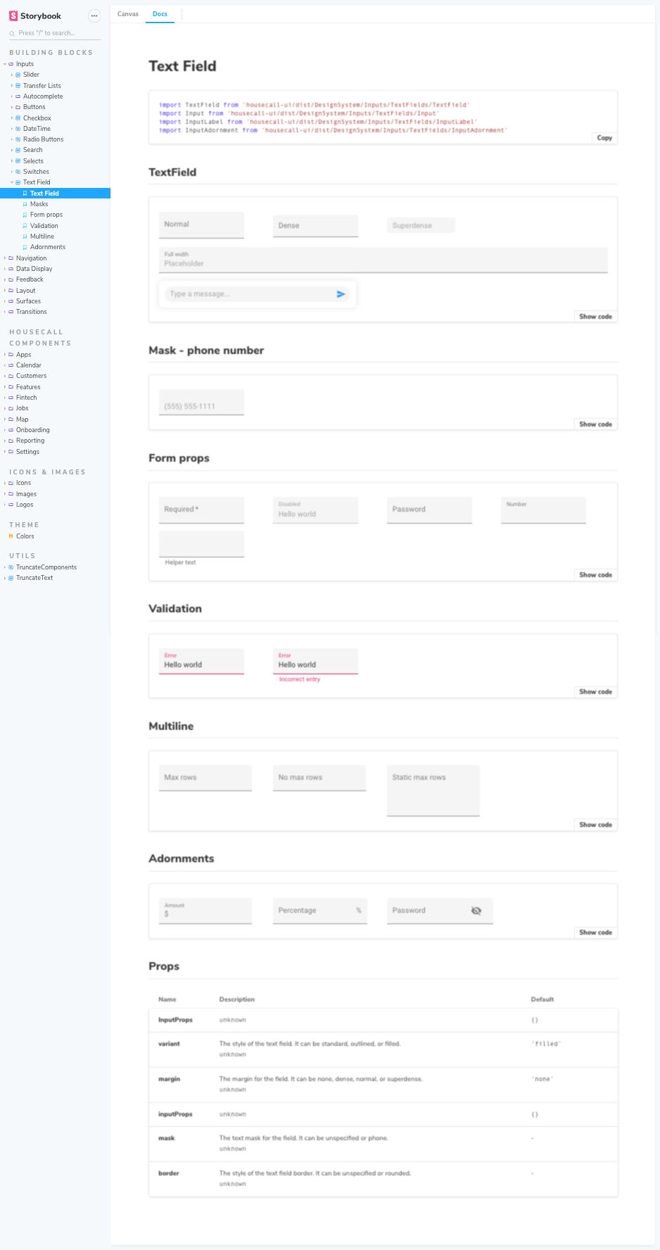
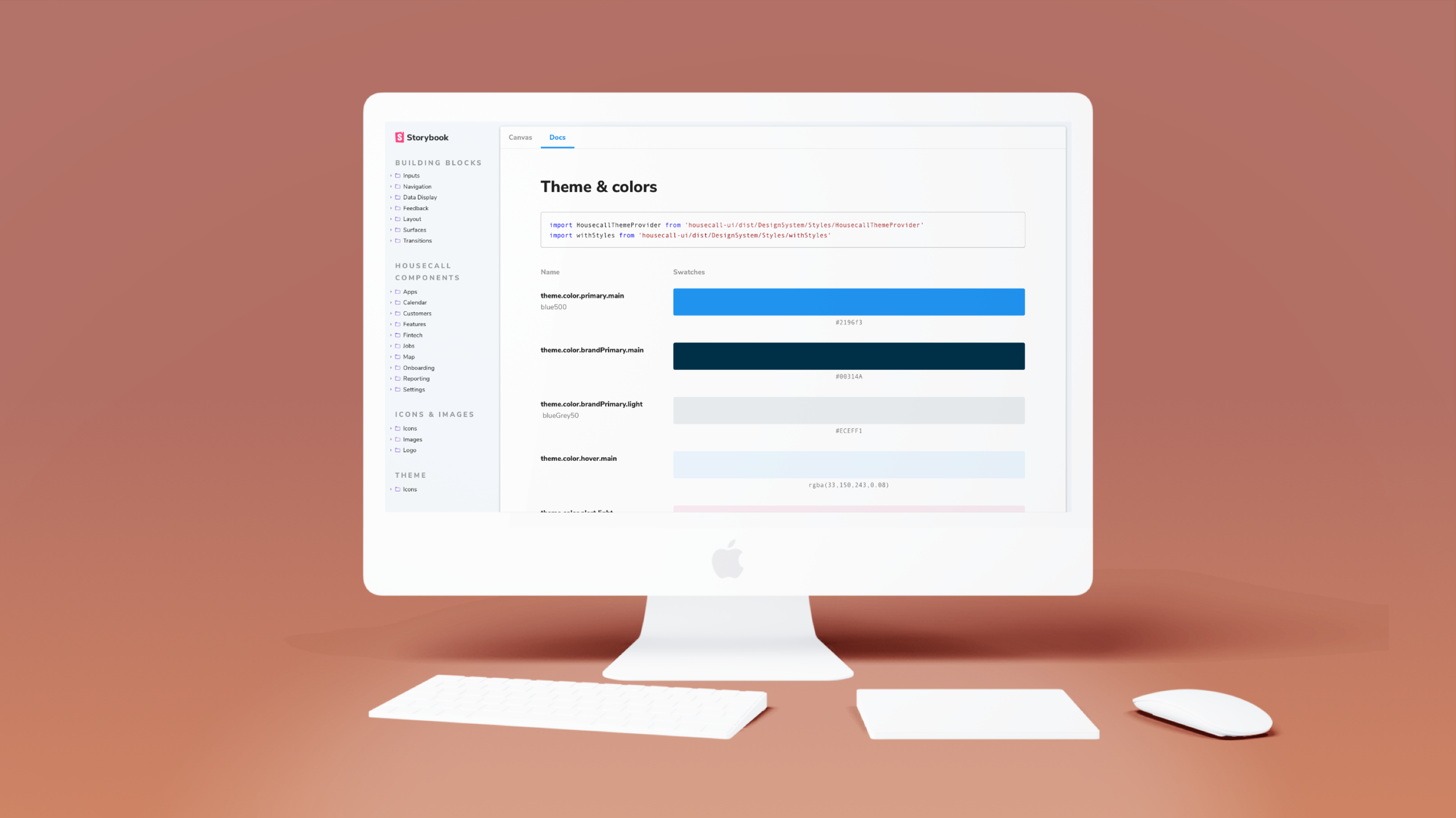
Once we’d settled on which components we wanted to continue to use, and what use cases they would be used for, I built a component library using Storybook and Material-UI. That library is used by our engineering team, to eliminate development time spent building custom components, and as a tool to introduce future design hires to our product. I then replaced our components in the product with their new equivalent.
Components built for designers & engineers
The impact
More effiency = more creativity
6 months after implementing the component library across the engineering team, we saw a 9.05% increase in velocity. At that team size, the increase in productivity was the equivalent to adding 7 engineers to the team without adding costs.
It also allowed our design team to focus more holistically on UX and usability. Having a library of established patterns freed them to focus more on the customer problems and delightful experiences, without having to invent new UI patterns for each new feature.

